
The design of film titles has intrigued me from a very early age. Possibly since watching Stanley Kubrick’s 2001: A Space Odyssey in 1968. Or even earlier, seeing the opening sequence of John Frankenheimer’s Grand Prix. I watched both movies with my grandmother and grandfather respectively when originally released.
Title sequence is so
much a part of every film that in Apocalypse Now, Francis Ford Coppola creates drama from the onset by omitting opening titles altogether. His choice, which the ordinary spectator is probably unaware of, is skillfully made to get the viewer rapidly immersed in the story and to instantly set a level of heightened anxiety from that moment on that will stay with the audience throughout the film. This successful technique is used on a few movies after Apocalypse. A different version of this approach is often seen where the first scene of a movie occurs before the title scene, as is often the case in action or suspense movies. In Coppola’s film, the only hint of a title appears late in the movie as spray painted graffiti that reads “Our motto: Apocalypse Now”. Coppola astutely does this so he could copyright the film, which would be not viable unless the title is seen somewhere in the film. There are two versions of Apocalypse Now with different ending credits. A 35 millimeter version with ending credits rolling over blurred imagery of a burning jungle. The other, a 70 millimeter with no closing credits; only a copyright notice at the very end.
But when it comes to title designers, Pablo Ferro stands out as my all time favorite. Ferro’s unique style is evidenced in many films. In the original The Thomas Crown Affair, 1968, he perfected the split screen effects and transformed the text, imagery and graphics, delicately balancing black & white, monochrome and full color film snippets, converting them into highly pleasing Mondrian-like mosaics. The assembly of parts in the title sequence of the movie is almost literally taken from techniques used in printed media, most notably magazines. The frames-within-frames aesthetics, a revolutionary technique applied on this movie’s title sequence, is now commonly seen on the screen as well as on TV shows such as 24, and countless commercials. In Bullitt, Ferro takes this technique to an entirely different level of sophistication where full screen scenes interlace with his title work establishing an essential tenor of suspense. Beatlemania, a 1981 screen adaptation of the stage musical of the same name reflecting the turbulent events of the Beatles era, also has Ferro titles which are loosely comparable to what he delivered on Thomas Crown.
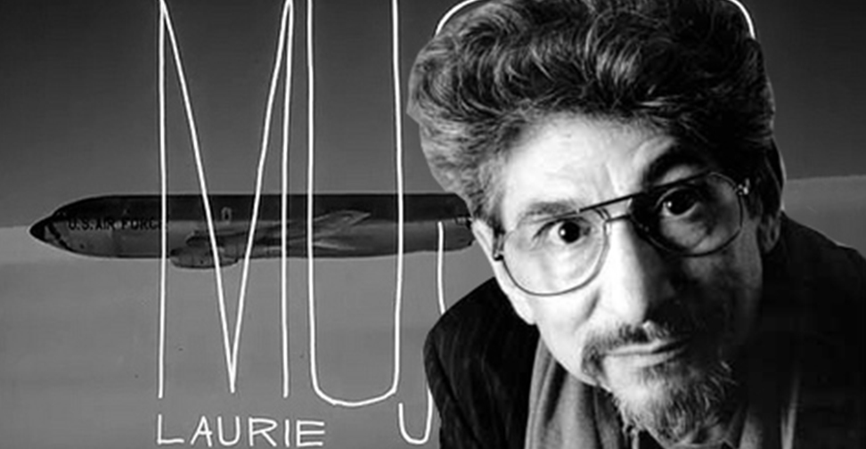
One of Ferro’s best known works, though, remains the title work for Stanley Kubrick’s 1964 Dr. Strangelove or: How I Learned to Stop Worrying and Love the Bomb. The pairing of Kubrick’s suggestive scene of a B52 bomber being refueled in mid air with Ferro’s handwritten titles superimposed on it as the musical score sets the mood in the precise moment of time and is considered a masterpiece to this day. After Dr. Strangelove, Ferro went on to work with Kubrick on 2001: A Space Odyssey and later on A Clockwork Orange. But what remains Ferro’s watermark across his five decades of delivering impeccable work, are his incredibly sensual, handwritten titles. What began with Dr. Strangelove, later transpired as a unique style to titles in movies such as Bones, American Heart, The Bronze Screen, Me, Myself and I, Men in Black II, and most notably, the 1984 film by Jonathan Demme, Stop Making Sense.
Pablo Ferro’s handwritten titles may have inspired other title artists such as Kyle Cooper in his work for the movie Se7en, and possibly the creators of the trailer titles for the upcoming Spike Jonze’s film Where the Wild Things Are. What is undeniable though is that Ferro was a pioneer artist who recognized the significance of typography in crafting stunning and engaging title sequences. The constant use of kinetic and somewhat “off-grid” typography, with still and moving imagery gracefully prepares the viewer for what is to come: a motion picture.
Some of Pablo Ferro’s other movie title credits include: As Good as It Gets, Beetle Juice, Being There, Darkman, Doctor Dolittle, For the Love of the Game, Good Will Hunting, L.A. Confidential, Men in Black, Midnight Cowboy, My Big Fat Greek Wedding, No Way Out, Philadelphia, Psycho, That Thing You Do!, To Die For, and To Live and Die in L.A., among many more.
Pablo Ferro moved from Cuba to New York in 1947, at the age of 12. After working as a comic book artist and animator, he partnered with two others to form a production company that would subsequently turn into Pablo Ferro Films, an outfit dedicated to short format TV commercials. He would later work for cinematic giants such as Kubrick and Hitchcock, as well as others. I decided to make Pablo Ferro one of my topics of writing for this blog since its inception. While researching his background, I pleasantly discovered that he had been recently awarded the 2009 American Institute of Graphics Arts (AIGA) Gold Medal, a well deserved honor for an artist who has had an extraordinary career. A documentary by Kihou Productions and director Richard Goldgewicht on Ferro’s life and work is in the works and will be available soon.